Instagram grid banners that work in the grid and in the feed
A grid banner is three posts that read as one image at the top of your profile. The hard part is that each post also shows up alone in the feed. Here is how to design for both.
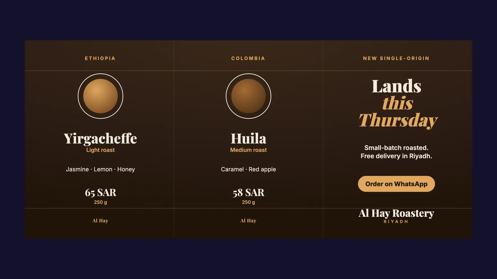
A grid banner is one wide design cut into three posts. Published in the right order, they sit side by side at the top of your Instagram profile and read as one image.
It is one of the best things you can put on a profile, and one of the easiest to get wrong. The reason is simple: every banner lives two lives.
Life one: the profile grid
When someone opens your profile, the three posts sit together on the top row. Here they are one composition. A colour, a shape, a photo or a line that flows across all three is what makes the row feel deliberate.
Instagram now shows profile tiles at 3:4, so each post should be 1080 × 1440 pixels. The whole banner is three of those side by side: 3240 × 1440.
Life two: the feed
This is the part most banners forget. Your followers don't see your profile. They see each post alone, in their feed, often days apart.
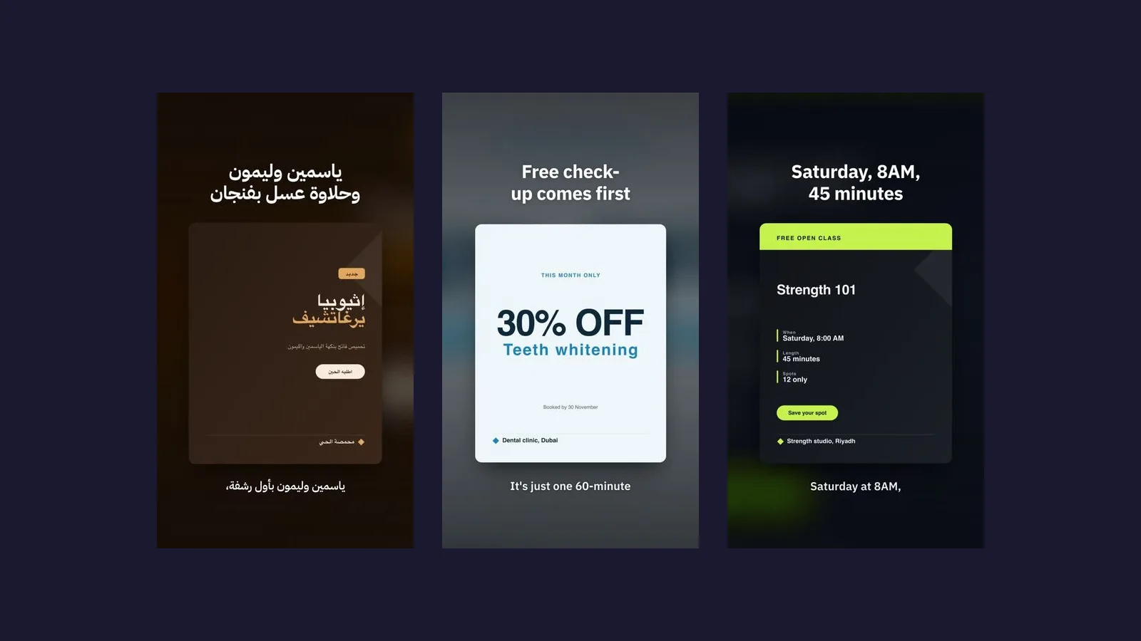
A banner whose headline runs across the cuts falls apart here. The first post shows half a word. The second shows a fragment of a picture. Neither one says anything.
So every tile has to be a complete post on its own:
- Its own message. One clear idea per tile: the hook, the product, the offer.
- No text across a cut. Keep every line of text well inside one tile. Shapes, colour and photos can cross the cuts; words can't.
- The brand on each one. A small mark or name on every tile, and the full logo on the last one people read.
- Room at the top and bottom. The feed can trim a little off a tall post, so keep text, logo and product away from the very top and bottom edges.
Pick an idea, not a layout
The banners that work start with one specific thing you want people to know, then pick the format that carries it:
- A story in three beats: where the coffee comes from, how it's roasted, your cup.
- A lineup: three products side by side, each with its name and price.
- One sentence in three complete parts: "Roasted Thursday. Delivered Friday. Brewed by you."
- Proof: three real numbers or promises, one per tile.
Generic lines like "Quality you can trust" are what make a banner forgettable. Use something only your brand can say.
Publish in the right order
Instagram puts the newest post at the top left. To make the row read left to right, publish the rightmost tile first and the leftmost tile last, a few minutes apart.
How Intilq does it
You describe the banner in one sentence. Intilq designs it for your brand, writes a caption for each post (each one is seen alone, so each gets its own), and checks the result the way a phone shows it: the row at profile size, and each tile alone at feed size. It measures every tile, so a tile with no message, or text crossing a cut, is fixed before you see it. Then it schedules the three posts in the right order.

Start your first month today
Bring your website. In a few minutes you’ll have a month of posts planned, written in your market’s Arabic or in English, and designed for your brand.
Start without a plan
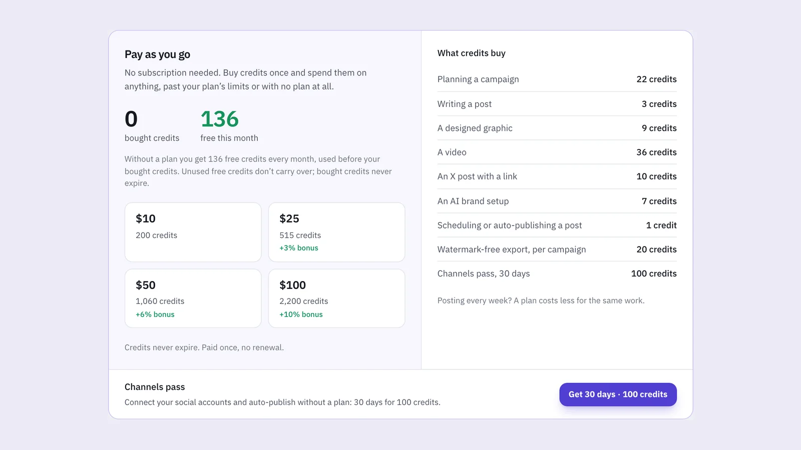
Every account gets 136 free credits a month: enough for two campaigns, eight posts and six graphics. Top up from $10 when you need more. No card to sign up.
Create a free accountPlans from $24 a month
Posting every week? A plan includes your posts, graphics, videos and auto-publishing for less. Pro is free for 3 days, no card.